Chinese cuisine with Brazilian zest
CHINA IN BOX
With 140 restaurants, the Chinese food chain founded by entrepreneur Robinson Shiba was acquired by Grupo Trigo on its 30th anniversary. The repositioning work included a new brand strategy, a language review, and an update of the China In Box visual identity.
In order to design a strategy that integrates both companies’ cultures, we put together a diverse group of people, including the restaurant founders, Grupo Trigo partners and executives, and a significant group of brand franchisees in sprint dynamics and interviews.
The collaborative process resulted in a shared vision by a group of people passionate about Chinese cuisine ready to improve all experiences that China In Box promotes: from the food origin and preparation to the physical and digital experience evolution in all delivery channels.
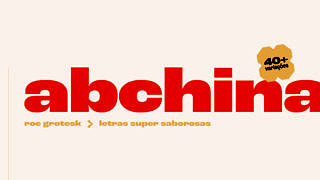
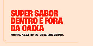
At China, the food is never tasteless, lukewarm, or boring. Everything the brand does oozes with flavor and energy. Inspired by the Chinese cuisine and its contrasting flavors, scents and colors, the New language system was created to provoke, enchant and atrract people.
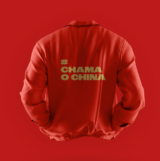
“China” is a lively and cheerful brand, everything it does is “super tasty.” This personality is shown in the tone of voice, which playfully uses words, expressions, and bold slang, with no fear of being silly. It is an openly vibrant and exciting brand.
An example of that is taking back the slogan “Chinaaaaaaaaaaaaaa In Box”, which gained a number of graphic applications in packaging design and communication.
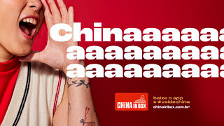
In color psychology, red is the color of passion, desire, intensity, heat, and appetite. In Chinese culture, red represents happiness, success, and good luck. Based on the strength of the color red, we used less saturated colors in the main palette, filled with meanings, such as white, black, dark red, and gold.
The secondary palette was based on the colors of the Chinese cuisine ingredients and brings freshness to communication, with different shades of green, yellow, orange, and purple.
The use of the new color palette causes impact, energy, and quick recognition of the China In Box brand. The support palette reveals the super flavor, highlighting the cuisine’s ingredients.


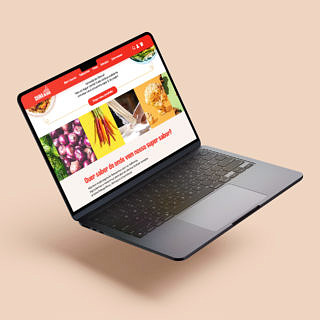
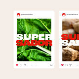
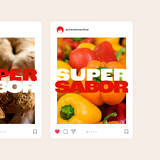
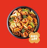
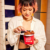
The brand colors, typography, graphic elements, grid, tone of voice, editorials, everything has been designed as a language system to reinforce the position of a super flavorful brand filled with energy. But perhaps nothing reveals the flavors and contrasts of the Chinese cuisine as much as the new photographic direction.
Our photos are designed to reveal the diversity and contrast of our ingredients and also to share our passion for Chinese cuisine. The camera zooms in on the dishes, presents new angles, and highlights their colors and textures. We included the people behind China in Box, our cooks and clients, depicting the moments in the restaurant through an enjoyable and autuentic approach.


Grupo Sal is more than just an experienced group in communication and brand building. Over time, they have acted as an extension of our internal team, such is the synergy we have achieved between our companies. In building the branding for the China In Box network, Grupo Sal once again brought competence, partnership and the ability to create a highly practical system in building the brand and a current, impeccable visual identity.
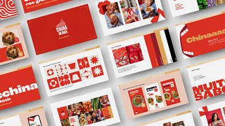
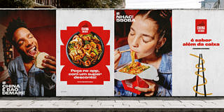

The redesign of the China In Box logo started from several premises developed in collaboration with the stakeholder group: keeping brand recognition without radically changing the brand, improving its legibility, and making it easier to use and apply in various digital communication channels.
In practice, we chose to maintain three main elements: the red, black and white colors, the graphics that represent the yakisoba, and the verticality of the main signature.


By eliminating the red box, we used its external shape to design the new signature, which gave prominence to the name China.
Once again, we invited Plau studio, specialized in typography design, to refine the noodle graphic and the letters, preparing its curves and proportions to improve legibility in reductions and applications.
What sets Grupo Sal’s methodology apart is that the brand language stems from the company’s core values. It’s an inside-out process that transcribes the essence of our business. It truly represents our soul.
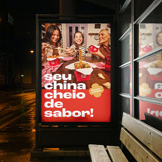
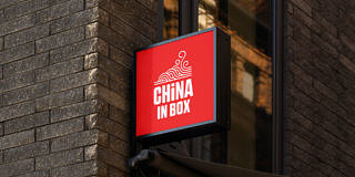

Assine o Saleiro
Nosso jornal digital é uma newsletter bimestral com pitadas de criatividade, dicas e notícias do Sal.