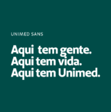
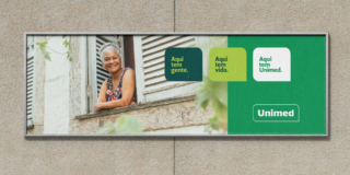
Here, there are people. Here, there is life.
UNIMED
Unimed, the largest global medical cooperative system, is celebrating its 55th anniversary with 350 health units nationwide, including over 120,000 health professionals and 19 million customers.
The brand combines national reach and local proximity — its physicians and health professionals work and live in their cities across Brazil and participate in their communities’ daily lives, with whom they share services, technology, and information.
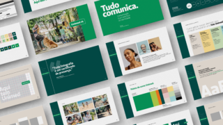
After repositioning the brand in a project led by Thymus, we reviewed the Unimed System’s entire language to open new paths for the brand’s evolution. The review included redesigning Unimed’s logo and signatures and creating an integrated communication campaign with films, spots, advertisements, and printed and online ads in a nationwide campaign.
Our task was twofold: First, we had to translate the brand’s strategic content, revealed by Thymus, into a new language that could embrace the 350 units spread across Brazil and turn it into an identity tool for the entire system.
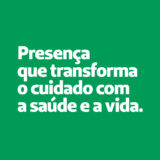
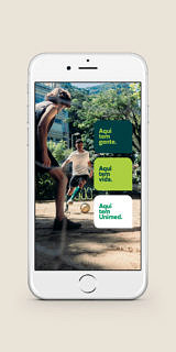
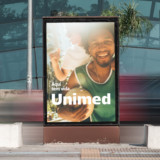
Second, a national communication campaign was put into place by the Unimed System to materialize its new positioning: Here, there is life. Here, there are people. Here, there is Unimed.
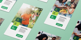
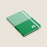
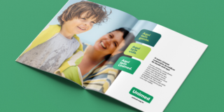
The color palette was a key element of that new language, so it was rethought after the brand’s main color: the Unimed’s green. We reviewed all the other colors’ relationships and proportions to enhance the green’s leading role.
Citrus orange and green become part of the institutional palette in a prominent place, balanced with a supporting palette featuring medium tones with less saturation and contrast. White gained strength and opened up important space in the layouts. The main objective is to strengthen the brand’s identity by underscoring Unimed’s green.
Unimed’s language was organized in a system strong enough to support the brand’s identity and now ranges from complexity to simplicity so that the hundreds of regional units could, in an easy and practical way, implement the design and day-to-day communication in all materials and platforms.
All layouts and applications use a modular grid in a rational and proportional way, creating an information hierarchy, improving readability and making room for each layout element to be appreciated.
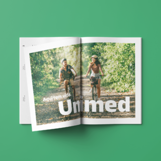
The new photographic direction imparts togetherness, humanity and intimacy, revealing a sparkle in the eye, the different skin tones, and the people who build Unimed and live in cities throughout Brazil.
Finally, the verbal language became more intimate, simpler and more personal, presenting the local accents and points of view of employees, members, doctors, and health professionals that make up the Unimed system. By recording the cities’ everyday life, we reveal the proximity of a language that values people’s quality of life.

The ‘Here, there is Unimed’ already existed as a brand asset. Still, the new language and the repositioning campaign expand its meaning, revealing the bond and intimacy of health professionals with the day-to-day of their cities and the commitment to improving the quality of life of their neighbors and fellow citizens.
The Unimed logo has more than 300 signatures and forms a complex system.
An analysis of all relationships revealed evolution opportunities, such as further enhancing the name’s significance – “Unimed: União de Médicos” –, reinforcing the strength of its institutional color – green – and also maintaining the brand recognition, which has been Top of Mind in its segment for 30 years.
Based on these assumptions, we eliminated the excessive threads that divided the symbol’s name and improved its readability and the relationship between the Unimed name and the units’ hundreds of signatures.
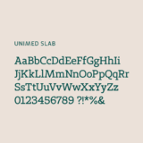
Next, we invited Plau studio, which specializes in typography design, to redesign the Unimed name’s letters and improve all of its proportions to enhance its readability and perception of humanity and contemporaneity.
Unimed’s new visual identity renews Unimed’s positioning. It organizes all its applications in a simple, singular and efficient way to maintain brand awareness and the strength of its 55-year history in Brazil.
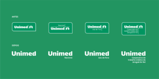
It’s a logo with many conjugations. The design went from complexity to simplicity: we eliminated threads and excesses, redesigned the proportions, and simplified the shapes for the brand to gain uniqueness, strength, readability, and contemporaneity.

We are a system of cooperative doctors and health professionals present in the entire country. The new language has the double challenge of evolving our system and strengthening the bond with our essence, employees, policyholders, and customers.
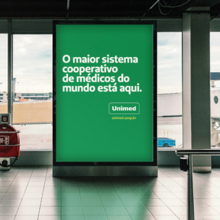

The communication campaign introducing the new language achieved more than 8MM appearances on display pieces and almost 1.5MM on video pieces, with a VTR of 92%. As for social media, there were more than 1.5MM appearances on Facebook and Instagram, with a VTR of almost 90%.
Assine o Saleiro
Nosso jornal digital é uma newsletter bimestral com pitadas de criatividade, dicas e notícias do Sal.