Japanese Outside the Box
Koni
We adopted Koni when it was only little. It was two years old and had less than twelve stores. A legitimate carioca from Leblon, this temaki restaurant has dictated fashion since birth. Nowadays, Koni is a national restaurant chain with over 100 stores. As the brand grew and matured, we identified the need to update the brand positioning and review the best place for “Japanese Outside the Box” in the Brazilian market.
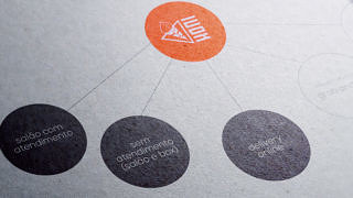
Work began by taking a deep dive into the brand’s roots and values, and the attributes which the brand wanted to attain. This dynamic brought together an eclectic group of Koni stakeholders, under the leadership of consultant Tiago Guimarães, a partner at Fubá Projects. We also revisited the brand’s architecture proposition and identified new opportunities in the different business models – stores with waiter service, stores without waiter service, delivery and grab and go.

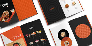
When we consolidated Koni’s positioning, we built a new brand book which included all of the information necessary to pave the way for a new language and behavior, one which was adapted to the new challenges. The redesign of Koni’s visual identity was inspired by essentialism, a concept which values what is fundamental for communication, using filters to develop a language and aesthetics with simplicity, symmetry, and geometric organization.
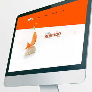



Essentialism highlights the elements and resources which are fundamental for good communications.
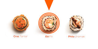
In the creative process, we also identified the need to rehash the logo. The aim was to give more meaning to the name “Koni”, reducing the logo’s association to the temaki product.

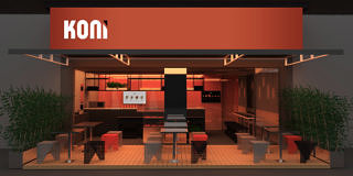

It’s always through totality and consistency that a brands choices, actions, and messages build value and communicate its uniqueness. As master Ricardo Guimarães said, “Branding is an identity exercise ”
Assine o Saleiro
Nosso jornal digital é uma newsletter bimestral com pitadas de criatividade, dicas e notícias do Sal.